
The production design of Batman Forever (1995)
Director: Joel Schumacher
Production designer: Barbara Ling
Summary
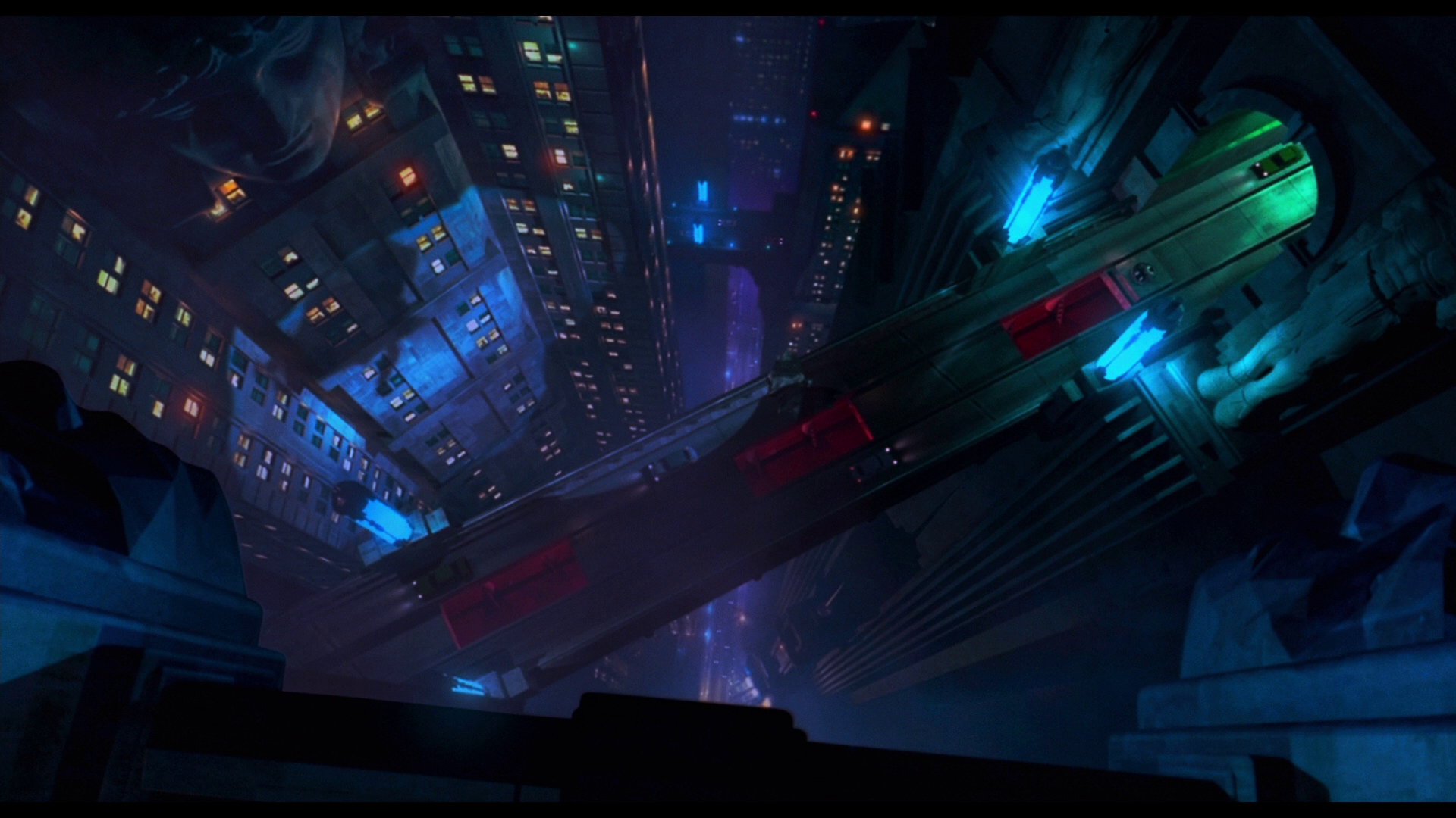
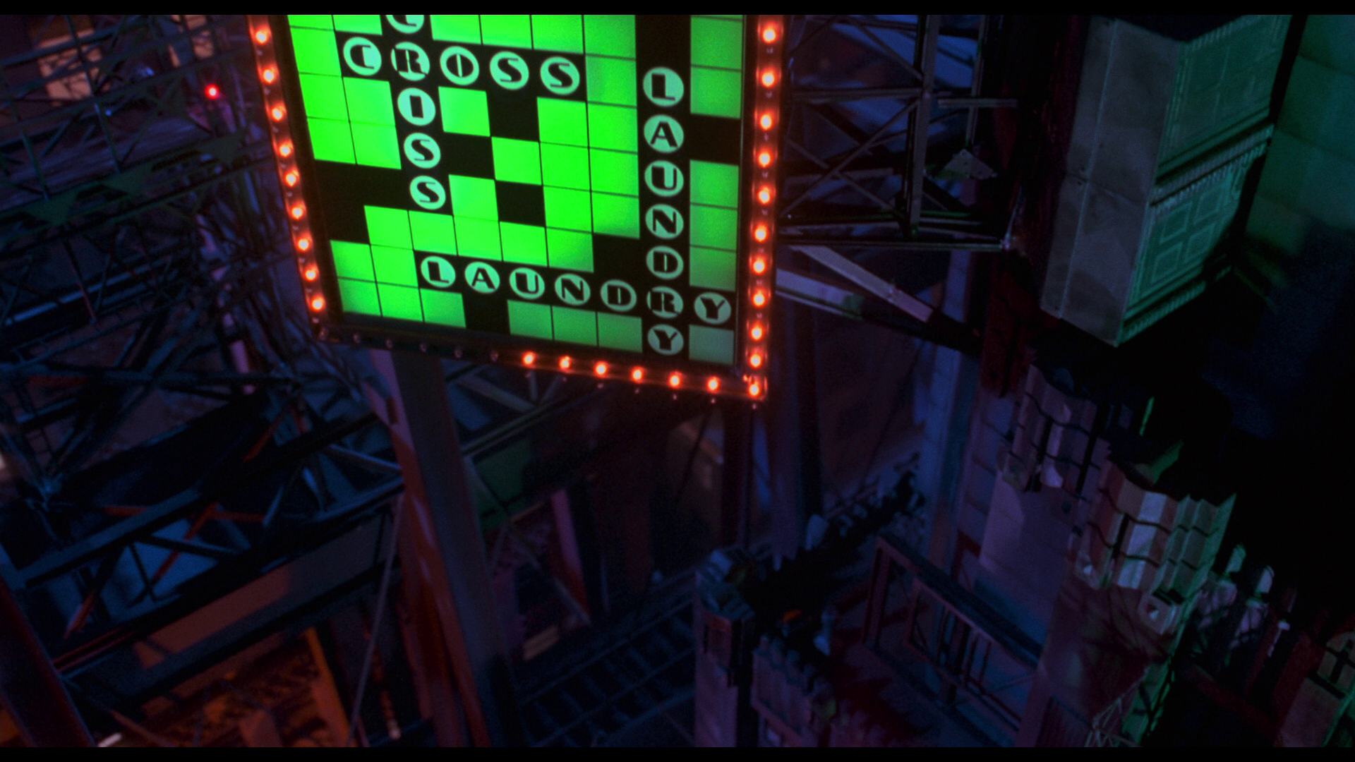
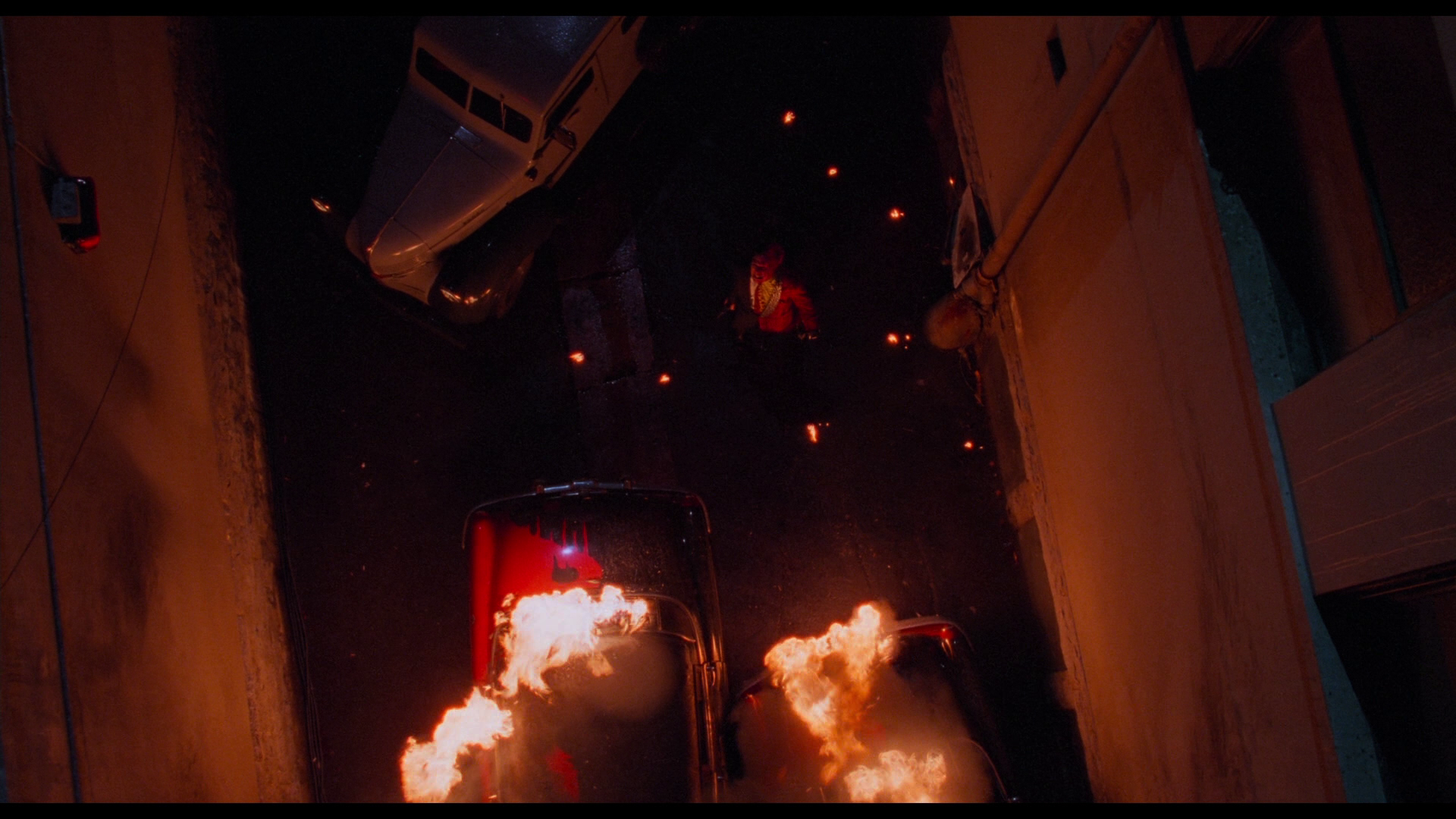
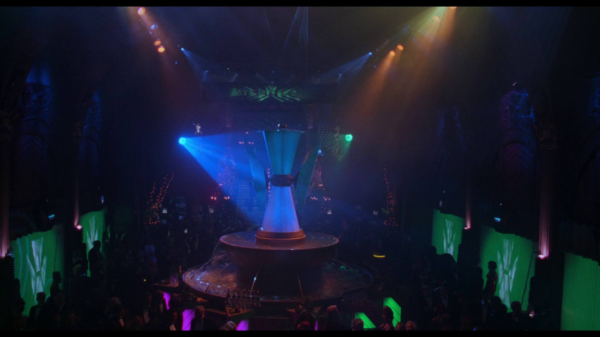
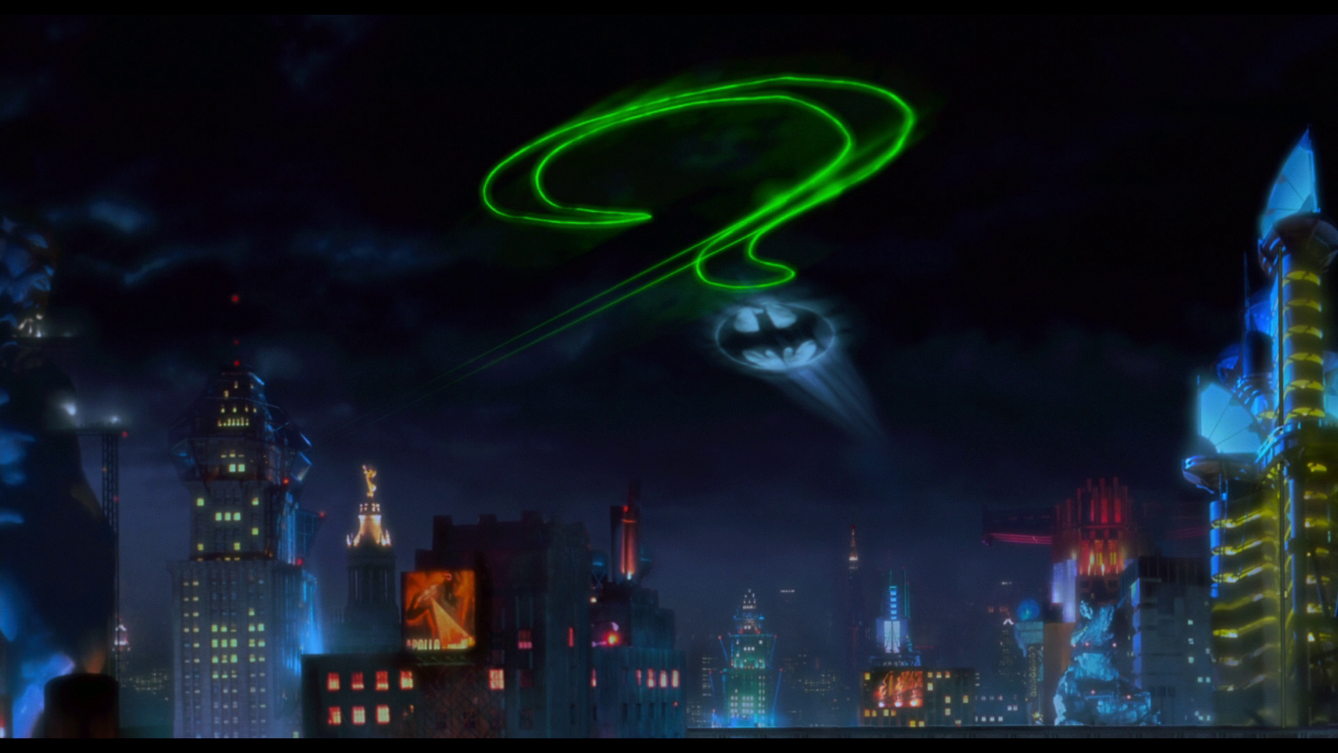
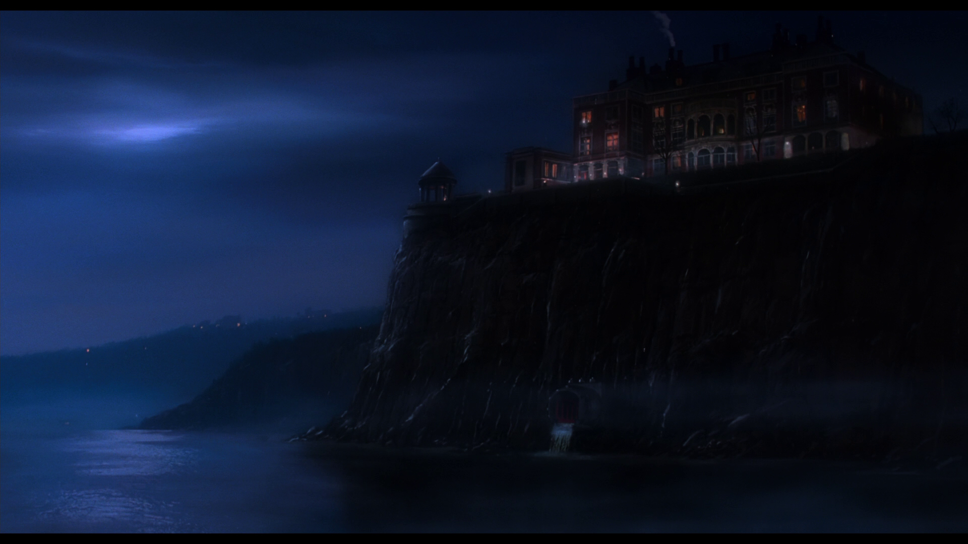
As one chapter ends, another one begins. Joel Schumacher’s take on the world of Batman was radically different from what came before. Although there are some minor Burtonesque touches, Batman Forever looks nothing like its predecessors. No more German Expressionism or Gothic architecture. This version of Gotham City is filled with neon colors, art-deco buildings and feels more alive by capturing a fusion of 1940s pulpy comics with the rise of the videoclip aesthetic of the multicolored 90s.
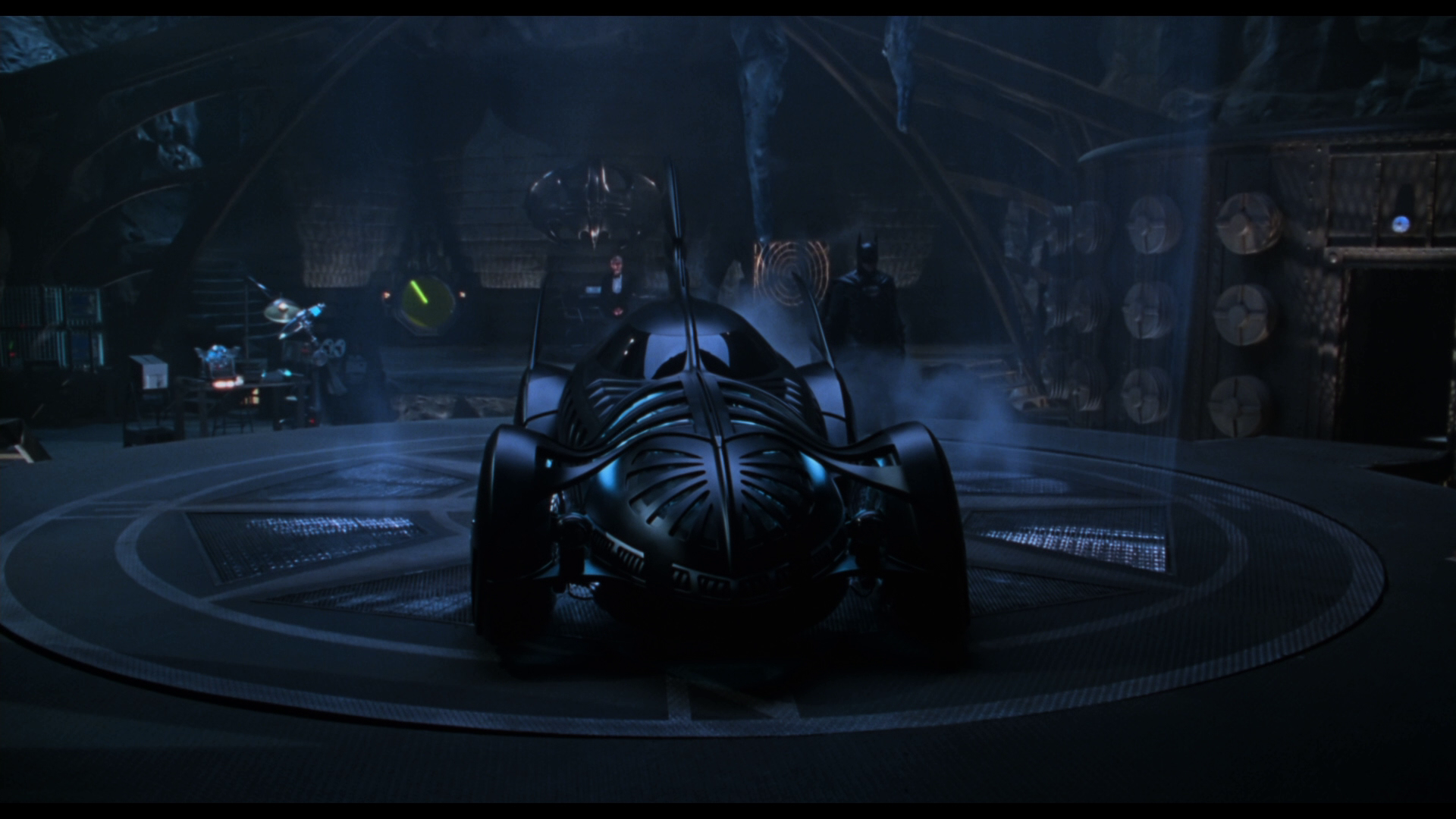
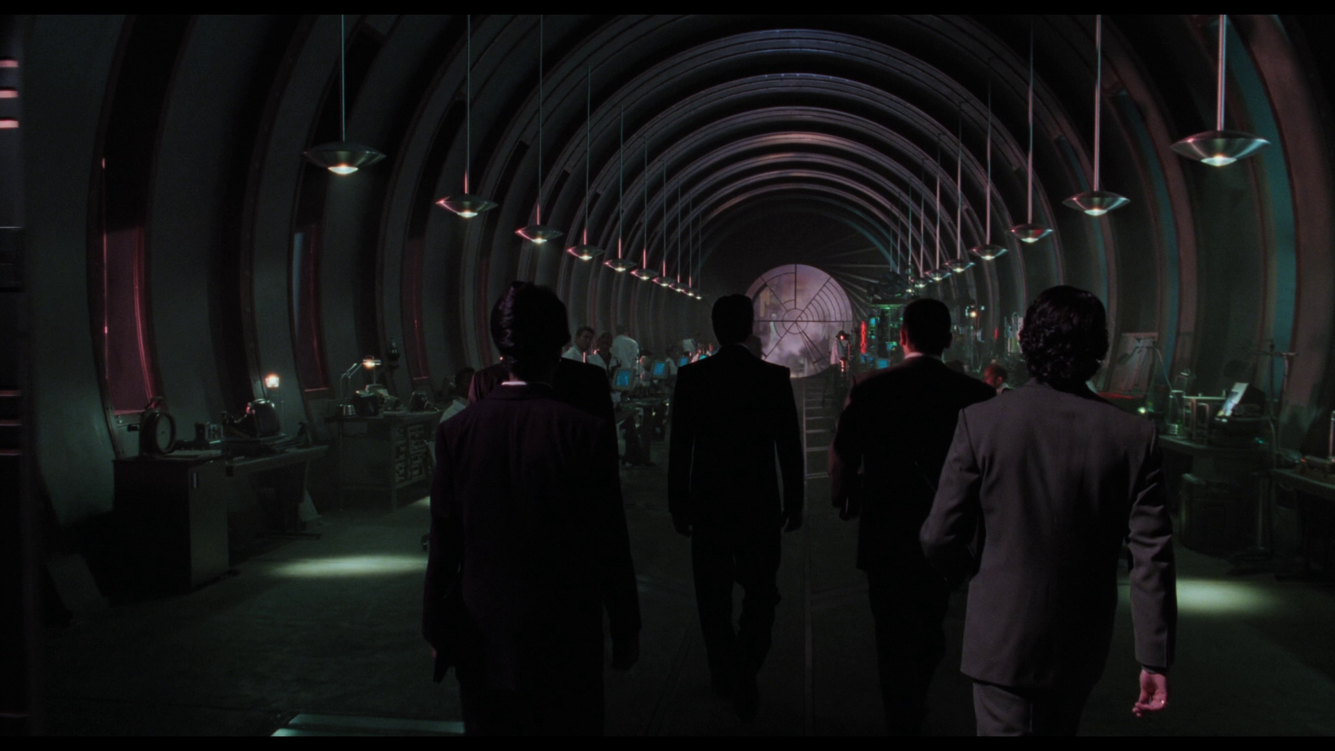
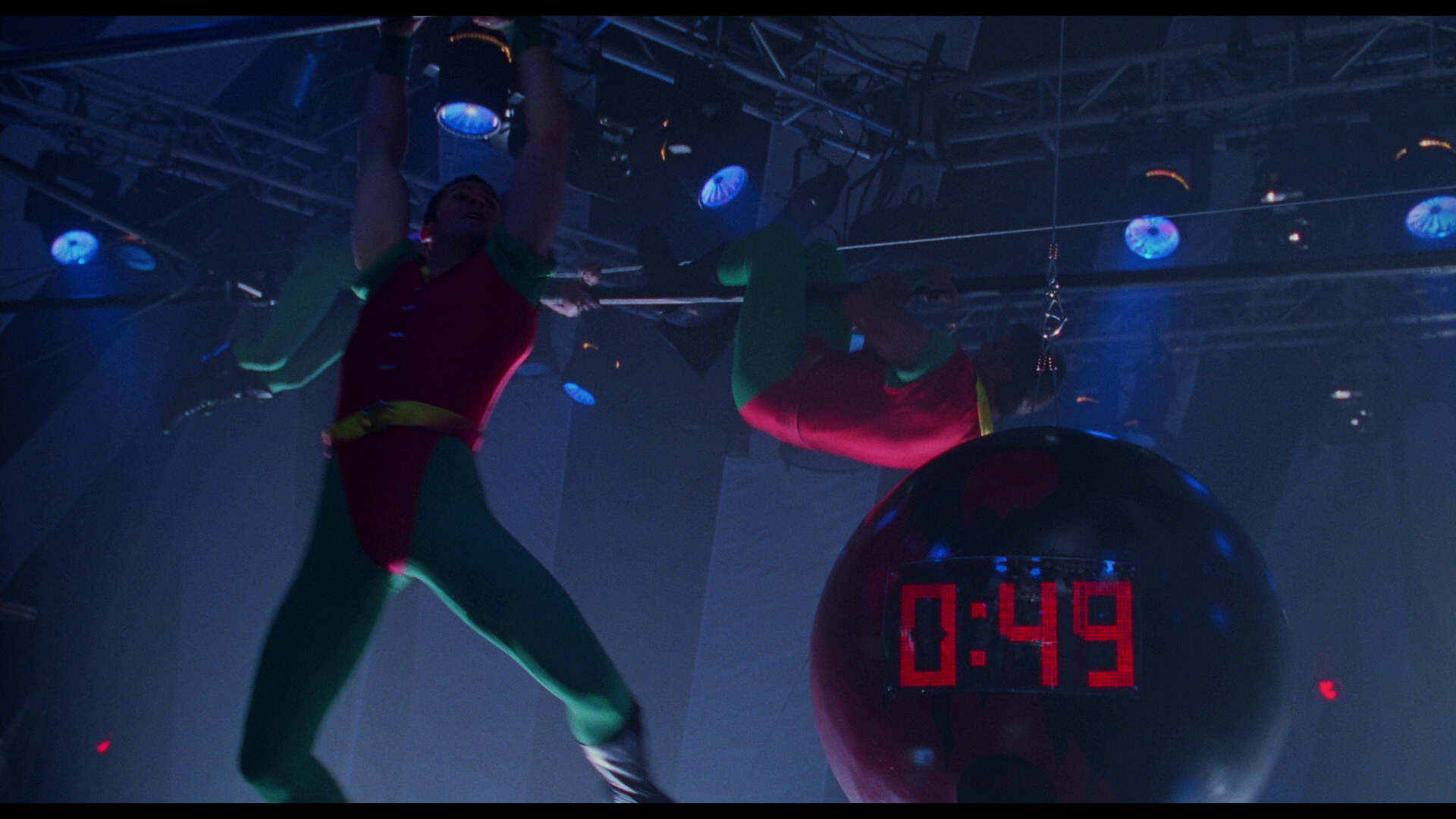
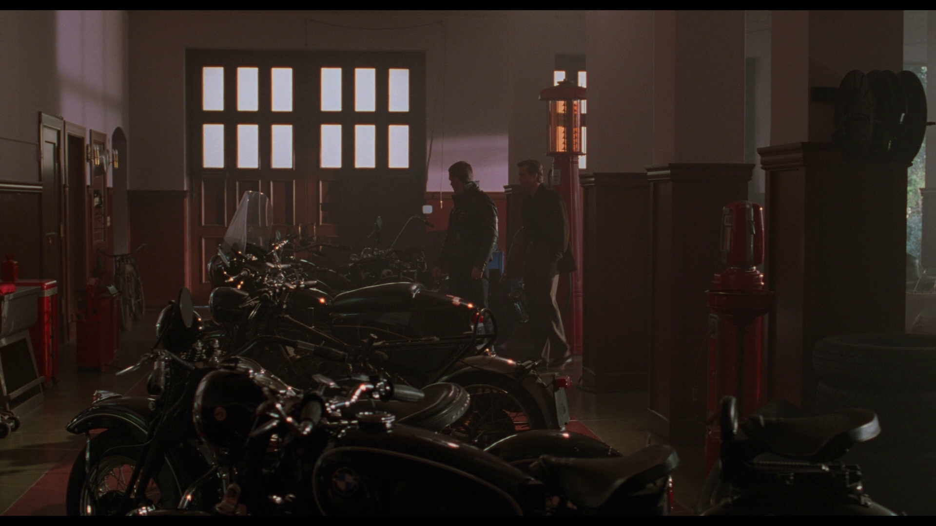
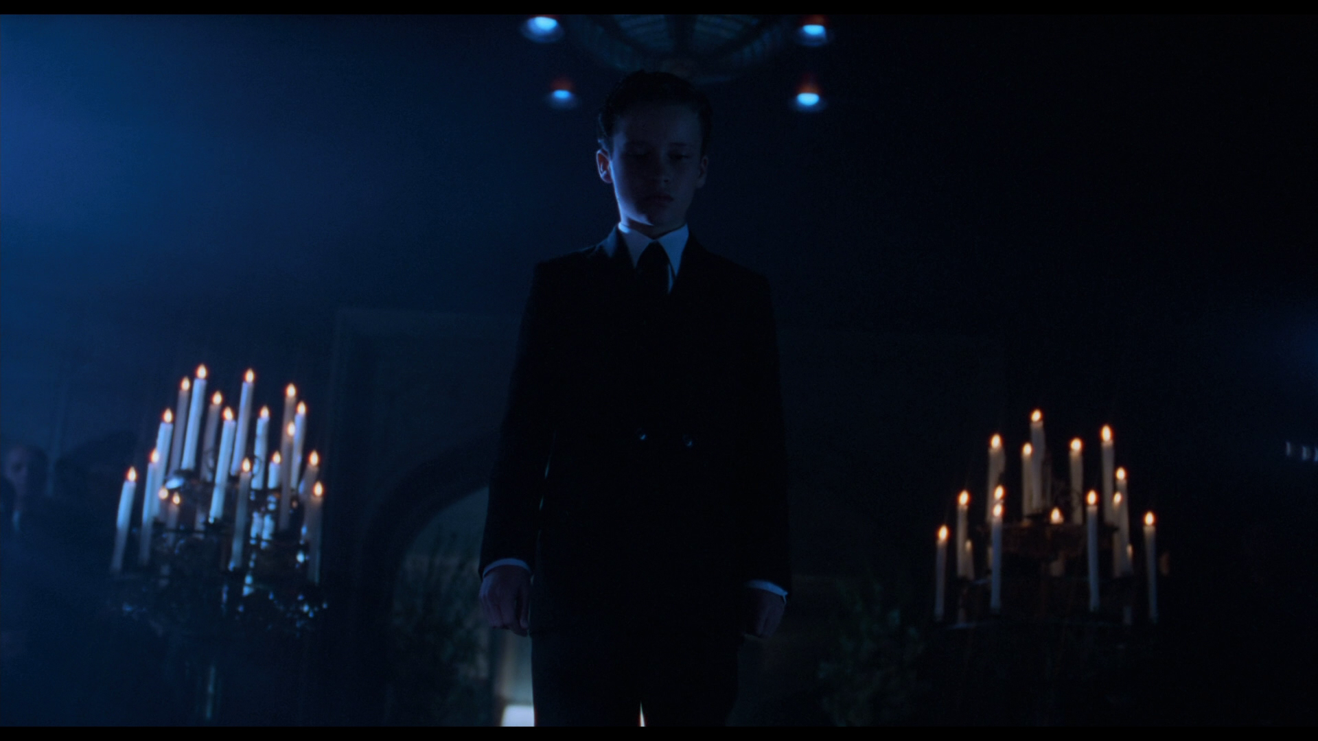
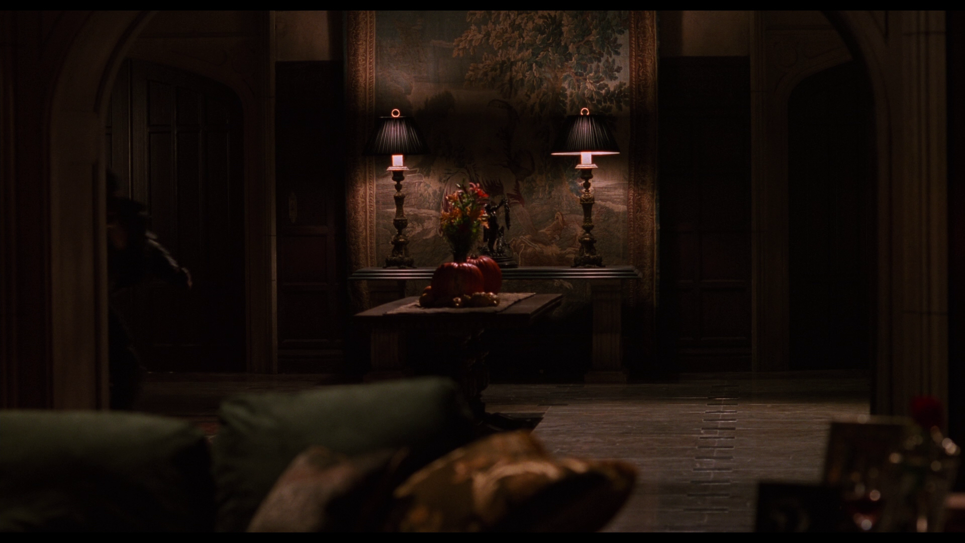
Schumacher desired for his Gotham City to have more personality on a larger scale, populated by statues of all sizes (inspired by the works of Ancient Greece) and neon light sources in almost every corner. He hired Barbara Ling (Once Upon a Time in Hollywood (2019)) for his production design who created a number of exclusive sets including the Riddler’s crammed space and magnificent techno-advanced throne room, Two-Face’s split-in-half lair, a more elaborate and geographically easy to follow Bat Cave, Gotham’s exquisitely staged circus (that looks like a circus) and a warmer Wayne Manor, all of which separate themselves from Burton’s soulless (on purpose) landscapes.
In Joel Schumacher’s mind, a ball has to feature flames, fountains, projectors, tv screens, lasers, rugs, a jazzy band dressed in neon-electric outfits, several extras each one wearing a unique and overwhelming outfit with a complementary mask.
Colours
Black, Neon green, Neon red, Dodger blue, Green, Russian violet, Seal brown, Bole, Cool black, Blue (Crayola)


1940/50s Batman comics
Art Deco
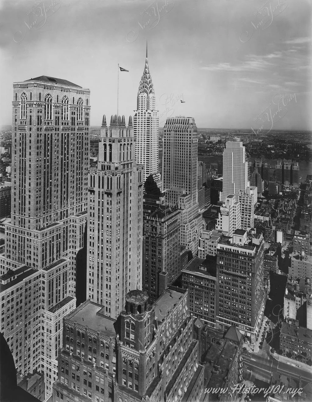
Influences

1930s New York City
Greek statues
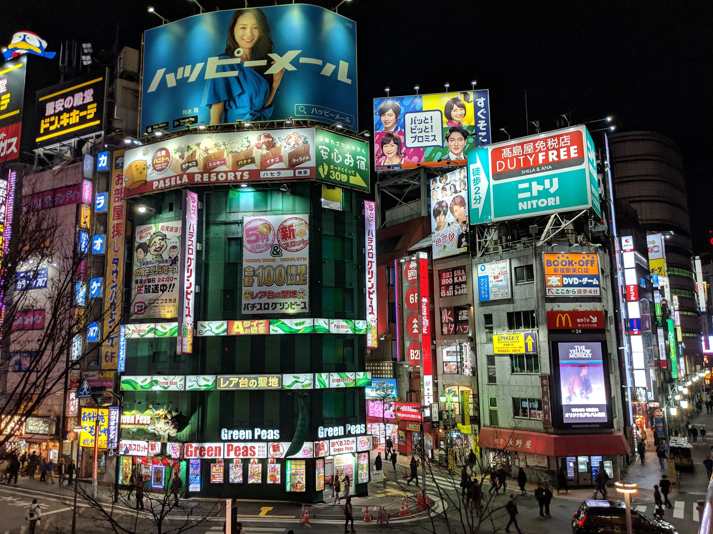
Modern Tokyo